sketch
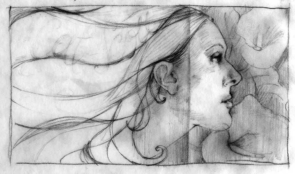
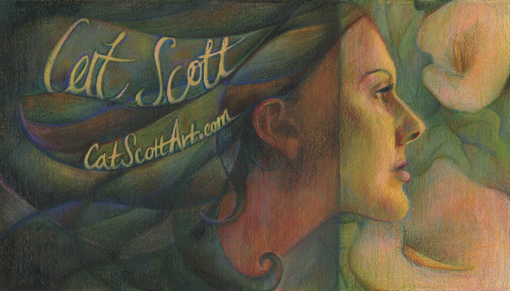
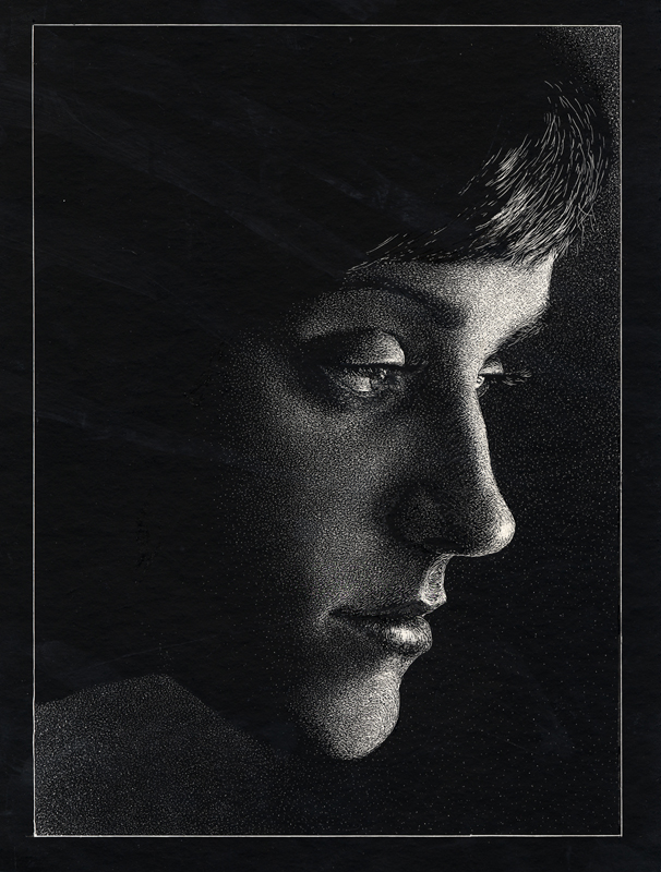
Here is my near-final sketch for the self portrait. My nose is too big (David said "I wouldn't be dating you if you had a honker like that!") - I honestly couldn't tell... i don't see myself from the side often so I don't have anything to compare it to, I guess. So the plan is to use this as a business card... you can kind of see where I had written my name into the hair. My next step is to finalize that script and probably to write "illustrator" underneath of it. My contact info and another drawing can be on the other side of the card, or perhaps I'll find a way for it to all fit on the front. We'll see.
The "concept" is 2 things rolled into one: emerging from darkness into lightness, as in new talent entering the market, and also that I am emerging from the ground and growing and developing. I don't know how well you can see it in the sketch but the left half will be a little darker and then the right half will be lighter (sterling style) and then the pattern in teh background (on the right side) is cala lilies, which are my favorite flower (andrea style).
I spent most of today trying to find car insurance and health insurance and all sorts of other crap... I hope I can get this drawing all done by Thursday :) I will probably post it at like 11:59 pm.
any comments would be greatly appreciated... Oh by the way, I gave my dad this web address because he wondered what happened to my old art blog (I got rid of it cause now i post my stuff here). Sarah, he really liked your illustration!
posted by Cat Scott at 2:36 AM
![]()
![]()

4 Comments:
its hard to say exactly because i cant see you or your reference but if memory serves me correctly the drawing might need work around the lips and chin. the nose i think is beautiful. i think this is a wonderful drawing. honestly. its gorgeous. i think your idea is strong and i think that it will make a beautiful card. is it going to remain black and white? keep it up i cant wait to see the final.
Cat, I love it, it definitely reminds me of you. I like the idea behind it too. You are sketching beautifully!
Hey cat, it looks so beautiful! I love it! The line in the profile and the line in the hair look great! I think the nose doesn't look too big at all, it's one of my favorite parts. I think the the thing that might be making it look a little large is the upper lip. I think you might be able to bring it out a bit more. The only other thing I might say is the bottom curl resting on the bottom of the page is a little awkward (being nit-picky). Maybe bring it up a tiny bit, or but off the bottom.
It's so beautiful Cat! I'm very impressed!!!
Cat, the piece looks absolutly beautiful. I can't wait to see the finish, especially with the type. In regards to the likeness, I think the shape of your chin is what's throwing things off -- I think it's out a bit too far. But other than that, the sketch looks great. There's a lyrical quality to it that I really love.
Post a Comment
<< Home