Also
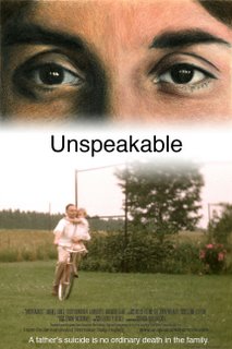
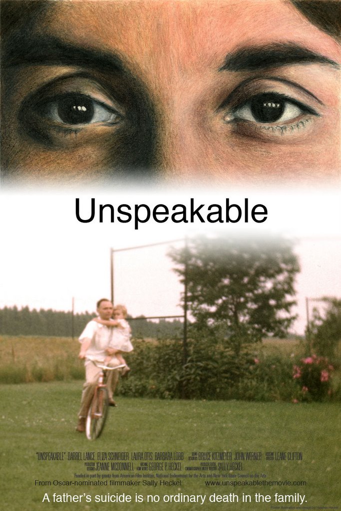
I am working on my aunt's movie poster. The film is about her father's suicide and how it affected the family. I would love to hear your input on the layout of the poster too.
Thanks!
Thanks!
posted by Heather Heckel at 3:26 PM
![]()
![]()

5 Comments:
I like how the word "unspeakable" almost seems to be covering up the mouth of the woman. I love that image - is that a still from old family movies? It's really a beautiful shot. This is asking a lot, but it might be cool if you could Photoshop out the big tree and the light posts and float the word "unspeakable" a little bit more in that white space. but then that might divide the composition too much.... I don't know :)
my only real issue is the text. it seems to be a strong typeface for the word it is portraying. i dont know maybe me. cat would know better.
Chris makes a good point - one thing I was never good at was choosing the right type face! I think you are right that it is pretty strong, but you could also play that down by increasing the kerning (space between the letters) or by making it a softer color, like a gray or brown or something. A simple sans serif font is key though, and you have that taken care of.
It looks great! I agree with the comment about the text, it seems to go with the top portion of the poster (in value), but the bottom portion is all lighter values. I think making the "Unspeakable" a bit lighter in value may work. The face is beautiful. Who is that a portrait of??
its aunt sally's eyes, it is a still from the film. thanks for the input about the text, i will definitely redesign it with that in mind.
Post a Comment
<< Home