Sunday, September 10, 2006
HOW TO FEEL MISERABLE AS AN ARTIST
- Constantly compare yourself to other artists.
- Talk to your family about what you do and expect them to cheer you on.
- Base the success of your entire career on one project.
- Stick with what you know.
- Undervalue your expertise
- Let money dictate what you do.
- Bow to Societal Pressures.
- Only do work that your family would love.
- Do whatever the client/customer/gallery owner/patron/investor asks.
- Set unachievable/overwhelming goals. To be accomplished by tomorrow.
ASSIGNMENTS
[12] - Wanna-be Academiers- June-July
Try to do the Illustration Academy assignments, or at least the idea-making and thumbnail part of it. Experiment, try something new, push yourself. Also use this time to catch up on old projects if you want![1] - SELF PORTRAIT - due Aug 31
Posted finishes:
Chris | Cat | Erika | Sarah | Tyler | Heather[3] - HALLOWEEN - due Oct 2
Posted finishes:
Cat[4] - EDITORIAL - due Oct 16
Posted finishes:
Chris | Heather | Cat[5] - SHORT STORY - due Oct 30
Posted finishes:
Heather | Tyler[7] - CELEB PORTRAIT - due Jan 31
Posted finishes:
Tyler[8] - CONVERSATION - due Feb 28
Posted finishes:[9] - NIGHT COLOR - due Mar 31
Posted finishes:[10] - ENTERTAINMENT- due April 30
Posted finishes:[11] - MAD COW - due May 31
E-mail me if you need the article again Posted finishes:- *I'll update these if people update their finals


2 Comments:
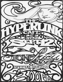
Hey Chris! It looks really good! I like how you left the rendering (shading) to the two most important parts, the girl and the name of the band, very effective.
I'm kinda trying to think of some lettering on the project I'm doing right now...how do you come up with so many great font ideas???
The final project reminds me of a wrought-iron fence....Like New Orleans French Quarter type design. I think it's got a really differnt look to it. Good Job!
yes Chris, much more successful than you think (after looking at it for so long!) Next time you should try to use solid colored text against solid background, try reversing out certain areas. Like if the whole poster was black with white script, and maybe the curly-q designs were a middle grey of some sort. Just something to try :) Good job, keep up the good work!
Post a Comment
<< Home