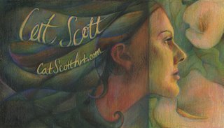
retrato del gato

Thanks for the comments on my sketch the other day. After checking it against my reference...
1) my nose was just a tad too big
2) my ear wasn't far enough back
3) my forehead was sloped too much
4) my brow bone jutted out too far
5) my chin was a little bit too fat
6) I think something was wrong with the lips but i can't think of what.
It will always amaze me that the difference of 1/16 of an inch can make or break a portrait.
Sarah, I didn't get the comment about the big curl of hair until I had finished the drawing :) Oops! Hopefully I incorporated it well enough. I didn't do a wash over this, maybe I should. I am really digging the right side of the painting... the left side is just a tad too primary for me, even though I used a lot of grays.
 I was looking at a Cezanne painting, Madame Cezanne in a Red Armchair. This image from the 'net doesn't do it justice: My book pictures it very rich with LOTS of grass green.
 comments are appreciated, I wouldn't mind doing some finishing touches on this.

3 Comments:
i like where it is going.i think that a wash may help but im not really sure it needs it. i was wondering, what if you maybe softened the transition between the light and the dark. it may not help given your concept but maybe you could try doing it digitaly to see before painting again on the piece. as of right now a lot of it seems to be very similar in value. that may have been the point.
Hey Cat, This is a great job! I think you nailed the design, and the colors are beautiful! I especially love all of the blue in the hair. I like the fact that you have these really rich, saturated colors on the left, then they move into softer colors on the right, it makes for a very effective image. The curl was brought down and looks great :). I think it's one of my favorites of yours. Fantastic!!!!!!!
Beautiful work Cat, the colors and design make me think of a stained glass window or Tiffiny Lamp design. I think the rhythmic shapes within the hair and the flowers emphasize that image for me. The one thing that bothers me is that the type in your first name is difficult for me to read. It looks a little too much like Celt rather than Cat. I think if you join the edges of the "a" that will fix the reability. But overall, a great piece!
Post a Comment
<< Home