sarah uses bright colors
 Hey guys,
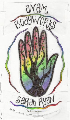
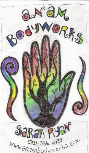
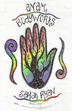
Here are some sketches for something I'm working on. I'm doing a business card/logo design for a lady who's updating her massage studio. She wanted something really psychedelic and colorful. It's been 100 times harder than I thought it would be...fonts are super hard. She's going to be printing these on like a brown cardstock. Could use some suggestions! Thanks
posted by Sarah Fox at 3:26 PM
![]()
![]()

3 Comments:
well i want to start off by telling you that i like the design. i can see that you are wondering about the embellishment squiggle things. i think it will help to have those be a little more integrated i think it will help solve the problem you are having. cant wait to see the final design.
Sarah, these are really fun! It will look really good on brown cardstock, the colors won't be as saturated once they print but I think it will look good. My favorite is the 2nd one down as far as the type integrated in the design, but I like the thinner squiggles you used on some of the other designs. Nice work!
Hi Sarah, I particularly like the bottom one. The colorful wavey lines don't detract from the hand for me as much as the other shape, and I like the letters that have some oomph to them with the color filled in. I also like the wavey colorful line carried undeath Sarah Ryan's name in the top version. Even so, the version with the wavey line under her name has smaller print for the phone/website address. In some ways the contact information is the most important part of the poster/flyer. It seems to me it needs to hold it's own and be readable at a glance.
Post a Comment
<< Home