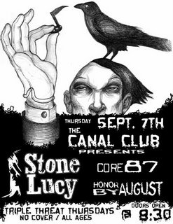
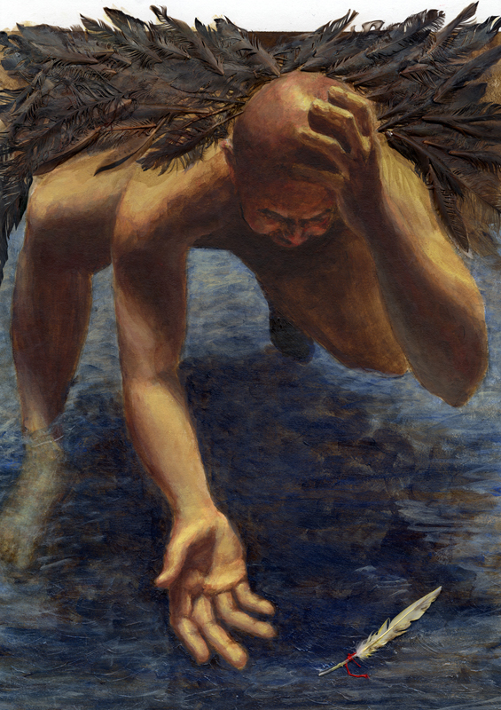
sept.7 stone lucy poster finished?
so i think that this poster is done. for just being a show poster i got pretty conceptual with it, it would take too long to explain. but the main idea was to have something eye catching. dont know if i did it or not. i think i could use some design advice for sure. it would help me greatly. so lemme know what you think. would you see this show?

posted by drawatron at 3:31 AM
![]()
![]()

5 Comments:
christopher, this is really cool! With some design background I feel comfortable giving you this advice:
1) Always think about negative space. The negative space around text gives it more emphasis than just size.
2) think about the heirarchy of information. What is the most important fact you are putting on this poster? Probably the band name, which is the biggest; check. But it could be more dramatic by having it alone in the middle of that huge black space. Date & Location is always important. Try to keep date & time together (I did a LOT of posters for skate demos so I got this event design stuff down)
3) Contrast of fonts. Just like you would contrast texture or color in a painting, think about using two contrasting fonts to explain your images. The same font used throughout an image makes it all run together.
4) Contrast of size and weight. I like what you did with the secondary band names. Very nice. You can push that contrast even more, and use the different fonts to push it MORE.
5) Alignment. This could be better if things lined up, and you can use your drawing to create the guidelines; For example everything could line up along the veritcal line that comes down from the thumb side of his arm, or from his nose, or from the left side of his face. It just helps organize information.
I wrote too much above, a few beers makes me talky and typy :) The drawing here is awesome. I can't get enough of that guys head. If I were looking at posters for bands playing live, this one would definitely draw my attention cause it involves actual TALENT!!!! nice work!
sorry i wrote too much ;) I lvoe this blog!
the advice is great, i say MORE BEERS FOR YOU! next round is on me.
Chris, this looks awesome!!! YAY! The hand and face are great, I don't have advice about layout design stuff, because I'm not good at that...it looks like Cat has that covered :) She so smarty. I would definetly go see the show, then after the show I would be sneaky and rip the poster off the wall and take it home with me.
P.S. I miss drinking the beers with you guys!
thanks sarah, thats awful nice of you to say. that means a lot to me. hooray beer!
I will make a special trip to Richmond to take you up on that beer offer ;)
Post a Comment
<< Home