SP BLAH
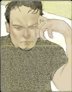
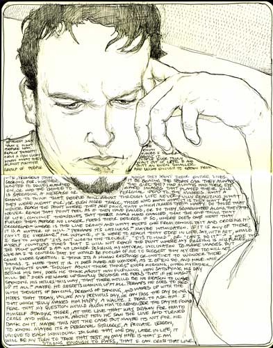
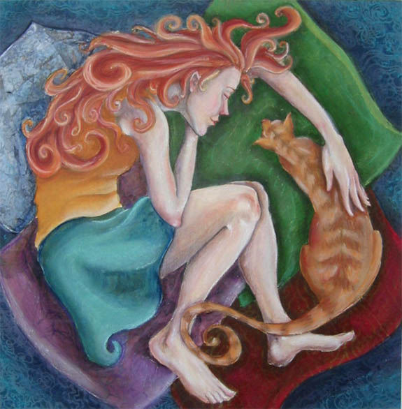
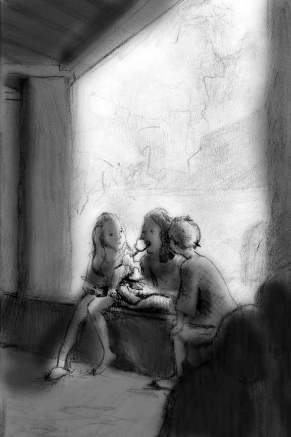
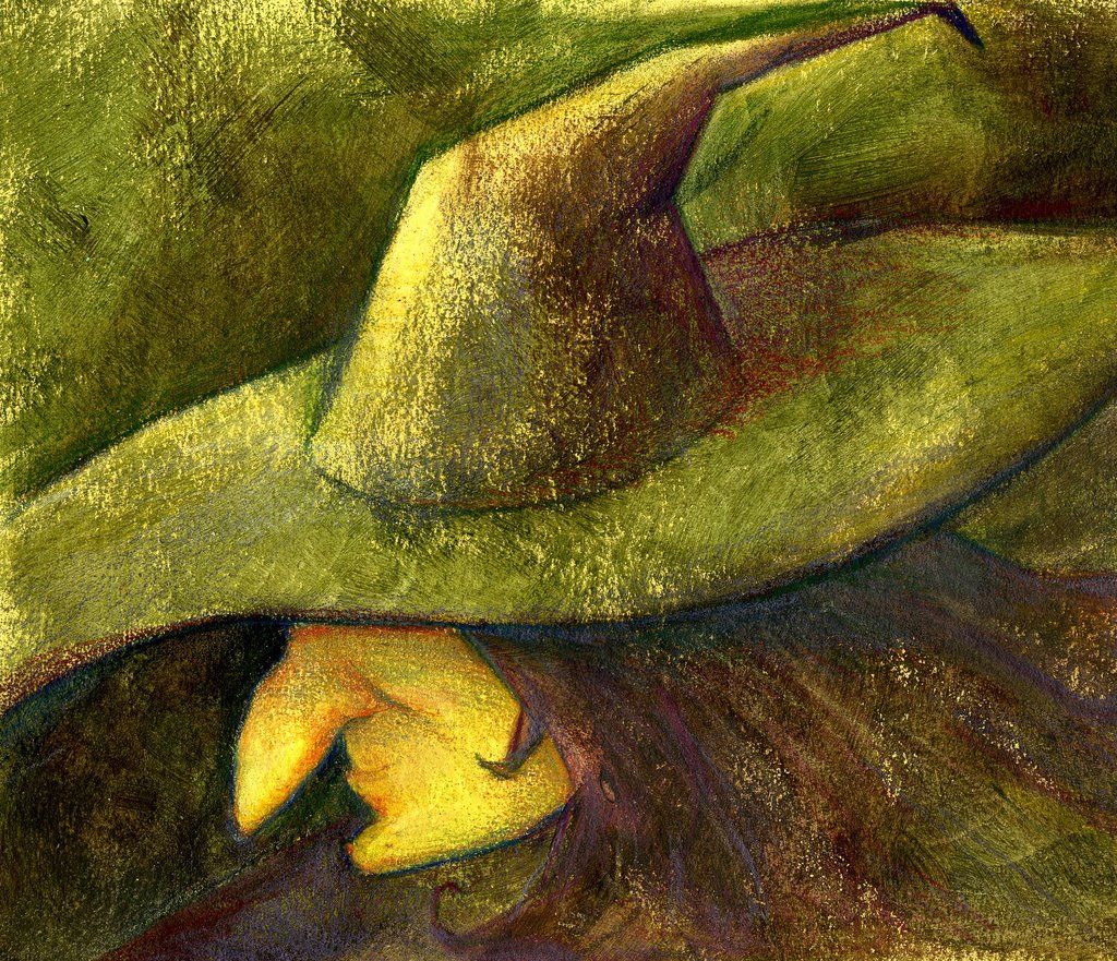
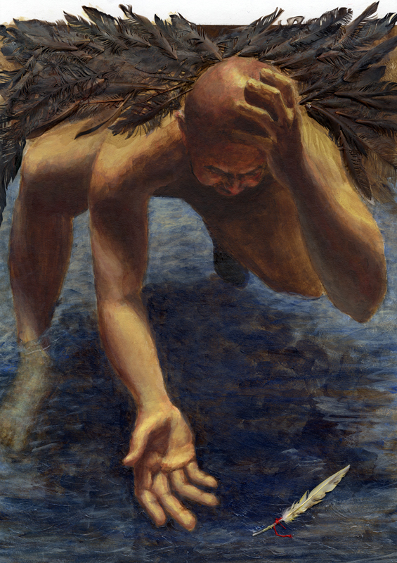
well i bombed this one. ran out of time, had to work to much, didnt like where my first idea was going. i did a drawing in my book (first image) and then decided to try to throw some quick color on top of it(second image) i think the drawing is alright but the colors look like shit. hopefully i can manage the children assignment better.


posted by drawatron at 12:39 PM
![]()
![]()

2 Comments:
christapha, I really like this. I love the shapes of the negative space. I love the hair. It looks just like you. The colors are fine, in my opinion it just needs more, this is an underpainting. What happened with the other piece? I bet it looks awesome and you just don't want to post it :)
Chris, the first thing I'm going to say, is I think you're being too hard on yourself! It's a good piece, with ann interesting concept and your drawing skills are showing through beautifully here, especially in the face, it's great. I think you need to build up the value a bit more in the face and hand (drop in a few quick highlights). I think the colors are fine, it's got a nice monocromatic feel to it. (did I spell that right?) I bet it would also look really good, if you put more bright blue in your eyes (since you have in Judy's words "those baby blues")! The bend in the right arm looks a little akward, but I don't if you did that as a design element to fit all the text in, if you did....just ignore me. But I think it's a great piece, and I think you're showing all your drawing talents in it, which is great!!
Post a Comment
<< Home