upcoming show
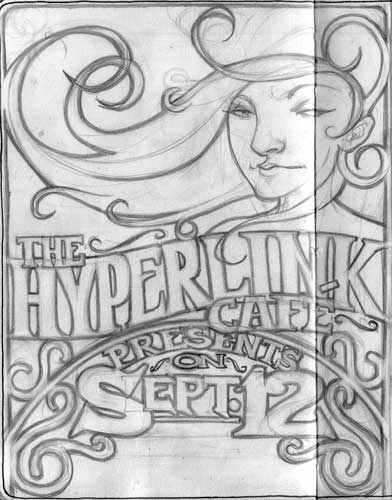
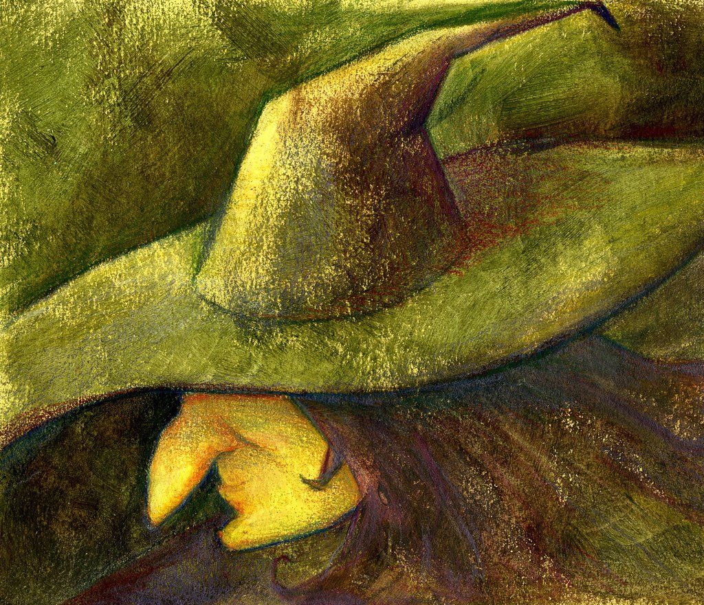
new poster for another upcoming show on the 12th. tried going in a different direction. thought by drawing the text i could have more creative control and would be able to make it integrate better. i was right, but after scanning it i noticed some problems that i thought i would be able to make work. this one is going to take some time. ha. lemme know what you think.

posted by drawatron at 11:57 PM
![]()
![]()

8 Comments:
I think it looks awesome. But does the woman represent anything specific? And is that enough room at the bottom for the band names?
How are you coming by all this band poster work? And is it something you'd like to do longterm or is it just something you're doing now for fun and/or a few bucks?
the poster actually runs down some, this is just the top, there will be space for the bands. the woman doesnt really mean anything, but people tend to see women as eye-catching. and since i went a little art noveau i decided to use the woman since it was a popular item in those posters. im getting this work because an art director i worked with is in a band. they are fun as hell to do to!
I LOVE IT! You're really great at these posters. The eyes kinda look like they are looking in different directions....but that might be because of the fold in the paper. Is this one going to be black and white or color?? It looks really cool!
it is indeed the fold in the paper that makes it look funky. it will be in black and white
i cant decide yet if the hyperlink text is okay or it needs to be reworked.
it doesnt look like its forced to be that way to fit in the space does it?
Wow! . . . Wow! Chris, it's amazing, the type is great and I love the art nouveau style. It definately grabs your eye and holds it.
The only thing that looks forced to me is the way the C in cafe overlaps the E in presents. Is there anyway you can move Cafe over the the right a bit without causing yoursef too much work?
But, despite that . . . Wow. I think you have rendered me near speechless. I can't wait to see the finish!
Chris this is BADASS. Excellent execution of the type, why even bother with a computer if you can draw it this well??? My favorite part is the date. I agree with Erika to try to move "cafe" over a bit. Another idea you could play with (on tracing paper of course) would be to try that contrast thing again with a more scripty font for the word cafe. If it contrasted enough with the font of hyperlink, and if it were a contrasting value or something, you could have it overlap "hyperlink" even more so it wouldn't smoosh "presents" so much. If you incorporate a cripty font, you could try using it in different places like "the" and "on" just for a little variety.
And another thought, make sure all the swirly curly-q's and stuff aren't as high contrast as the text, you don't want it to compete - it needs to be a fast read. Does that make sense?
Way to go with all this work, you are really good at it!
thanks guys. ill post the refined sketch later tonite.
Lookin' good! :high-five:
Post a Comment
<< Home