projects
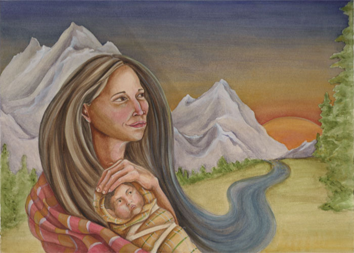
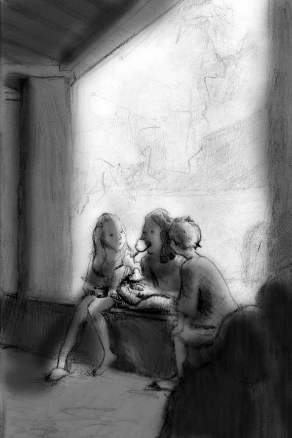
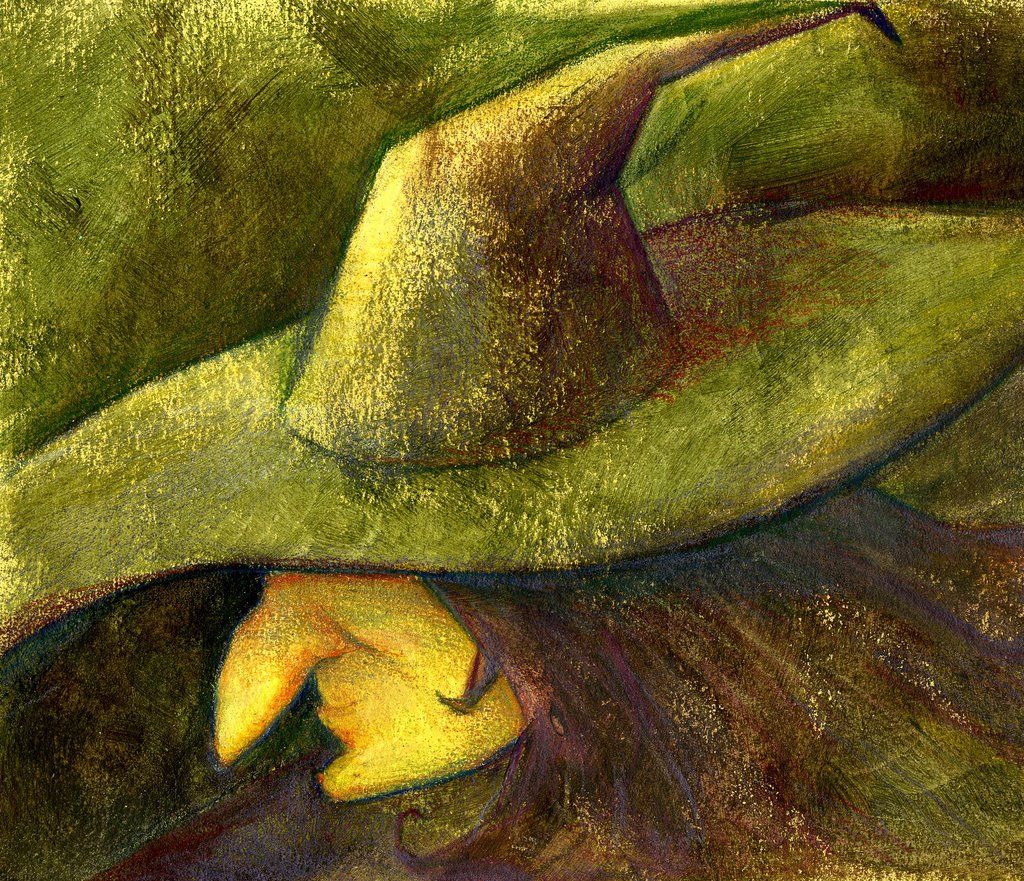
Well, I finally finished these two projects. I've been working on both of them at the same time for awhile, and finished them both last night. The top one is the finished image for the children's book. The right half of the image will eventually have a lighter box with text about Sacagawea over it. I think I may have over-worked her a little. It's a quick scan, so the color is kinda separated where the photo merge happened.
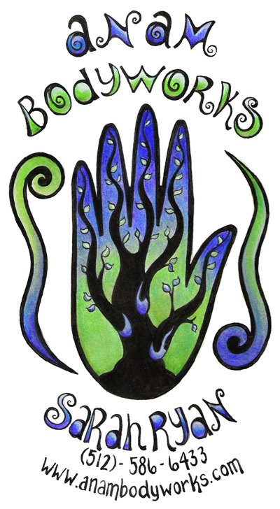
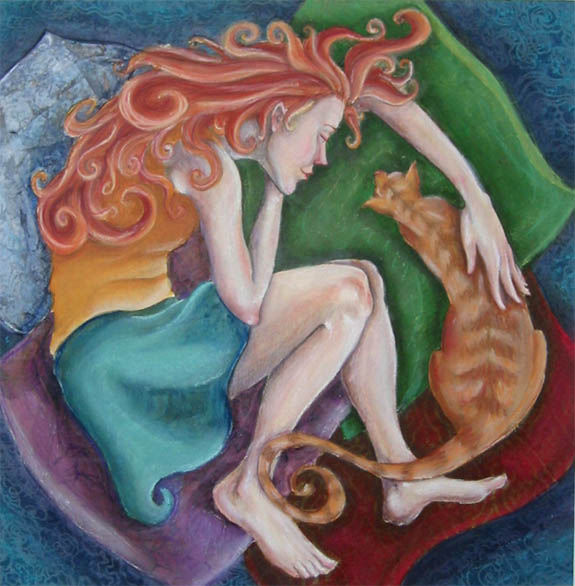
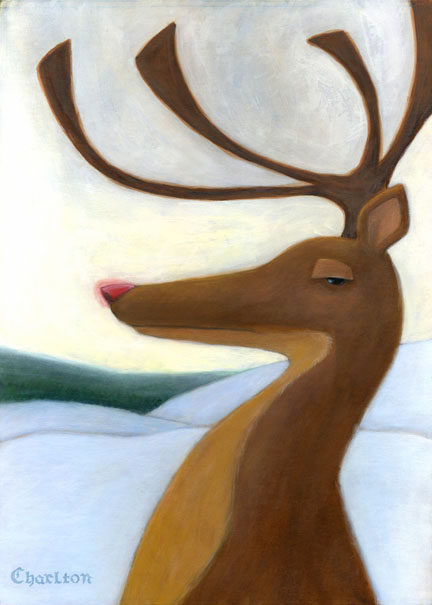
The bottom image is for a business card/logo for a local business. I traded with her for a bunch of free massages, which should be fun.
Please let me know what you think (especially with the top image). Thanks!!
posted by Sarah Fox at 1:17 PM
![]()
![]()

2 Comments:
Sarah, both of these pieces are beautiful! I love all the detail in Sacagawea's hair, shirt, and face - it doesn't look overworked to me. Something about the baby's face looks a bit like he has a 5:00 shadow, but that could be the scan. Look at you using Photomerge... and you said you didn't know computers :)
Are you going to set the type over the image yourself? Are you going to hand write it?
I really like the way the business card turned out too. It's really stunning with just the blue and green, I liked it with all the colors before too, but I think this is more successful! Nice work!
I can't wait to see more work for the children's book. It's such a good idea.
Great work, Sarah! I started writing all kinds of feedback but then my iMac froze on me and so I had to shut it down and I rebuilt the directory.
Anyway, Cat pretty much said everything I was going to say. ...but I'll offer my honest critique anyway.
About the baby.... someone said at the Academy, maybe Sterling, that you want very subtle changes in value when you're painting small children. Think of Sterling's "Princess Apple Blossom" illustration and how delicate that was. If you don't remember, then look at his recent John Mayer illustration. It also might help to have the baby's eyes closed. You're brave to paint a baby.... I don't think I could pull it off.
Also, some of the objects seem sort of cut out....lots of hard edges. Maybe it would "gel" together if you softened some edges. Though, I'm not sure how hard it would be with that medium. Robin Eley is really good about that...check out some of his recent stuff. I think if the landscape had more change in value and detail (less) as it receded, you'd strengthen this piece.
I love the drawing and the color of the fabric. I think the folds are very well done and I like the change in brightness within the fabric. I enjoy the hair, too. Hair is a tough area and I admire anyone who can paint and draw hair well.
About the card: That green and blue is so much more sophisticated than the rainbow, while also staying "psychadelic." And it gives the card a nice mood. It'll look even better on that brown cardstock. Sweet job!
I hope you don't mind the tough/honest critique. I offer it because I know you're good (I've seen your work) and I know you can handle it.
Anyway..... thanks for sharing your work and it's good to see that you're working at it.
Post a Comment
<< Home