Self Portrait, revised
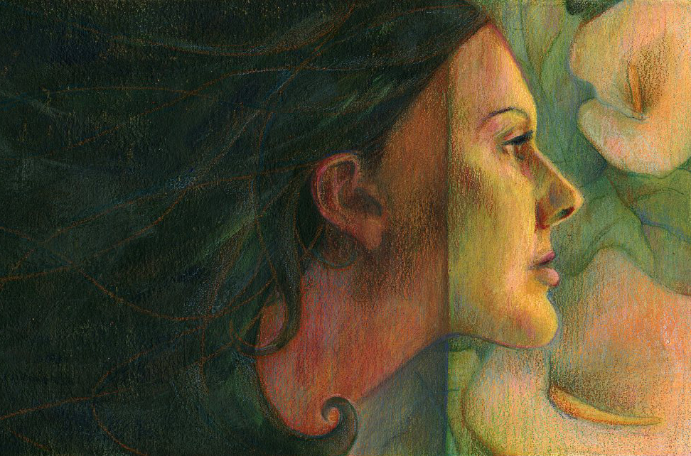

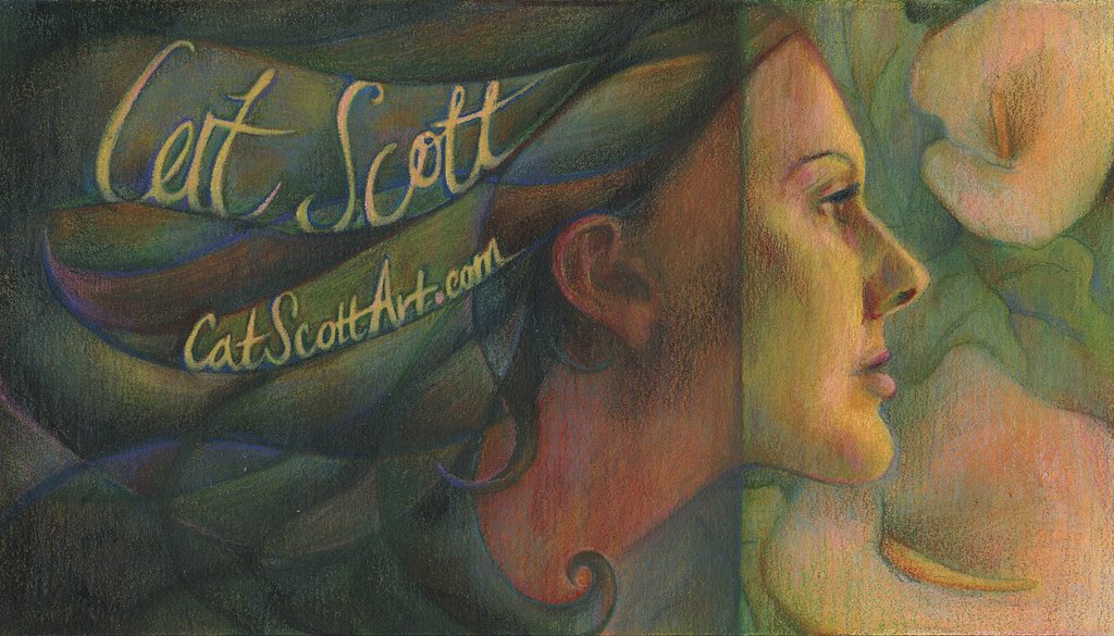
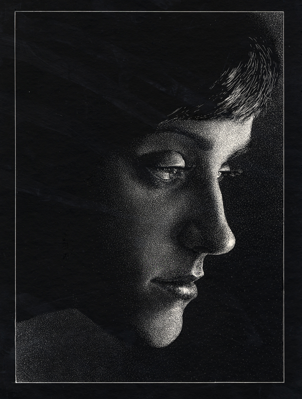
Hey everybody. I have been staring at my self portrait piece on my desk since I last posted it and it was driving me crazy. I finally went into it and made some revisions. First of all, I lost the handwritten text because I'm not going to use it for business cards after all and it just felt contrived or something. I darkened up the hair area and made it less colorful. I also cropped it in on both sides to try to balance it a little bit better. Do you all have any other advice? I am starting to like it a lot better now, but I still feel like I need to do something with the hair.
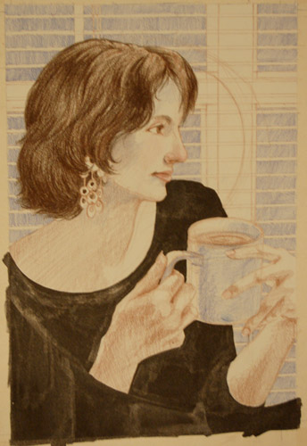
Edit 10/31/06 - added the reference photo. I don't think it's spot on, but let's be honest, I'm no Erika (who by the way was in my dream last night - weird, huh?).
posted by Cat Scott at 5:56 PM
![]()
![]()

4 Comments:
the hair closest to the light could probably use a little more color, and for some reason the jaw is still jumping out at me. can you post the reference as well.
i agree with deb, you nailed everything with the very tiny small itsy bitsy exception of the slant of the chin. its very close but take a look at it and im sure you can fix it. other than that i think you have something here.
It's amazing how difficult self-portraits are... I just don't get it.
I think the hair looks great.... but a few structural things will tighten it up nicely.
It might help to bring both images in to Photoshop, placing the illustration on top of the photo and changing the opacity so that you can see through to your reference.
Look at these things:
- the length and curve of the upper lip.
- the lower angle of the jaw line.
- the corners of the mouth and eye.
- the lower half of the ear.
I think the nose is drawn really well. I hope that helps and wasn't too much input. Please forgive me if I've been over critical.
Also...
Allthough I knew you were moving to the area, I just noticed that you're living right between the California Art Institute and the LA Academy of Figurative Art. I'm envious. Both are awesome resources.
The only thing I noticed was the upper lip could go out a little bit more. I think the piece works better without the letters, I like the large dark shape of the hair. It makes the colors in the lillies seem more vibrant.
Post a Comment
<< Home