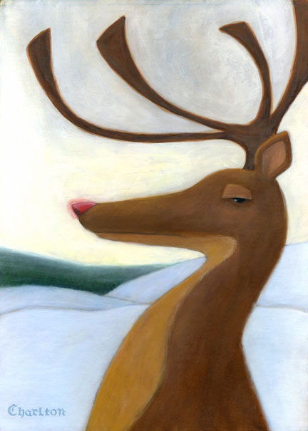
Witchin Illustration
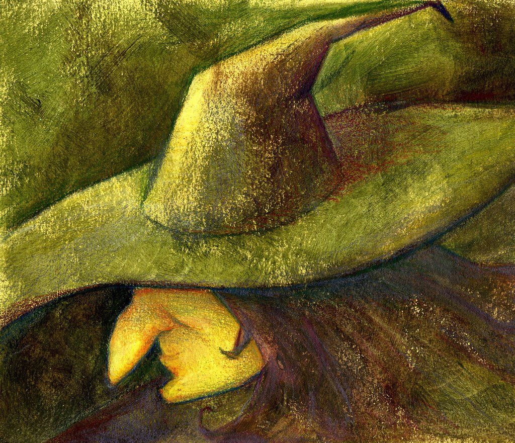
I did this really quickly for fun!! It's mostly drybrush acrylic, I really liked the texture I was getting so I let it show through in places.
Good news - I have my first assignment! It's for Louisville Magazine illustrating the controversy over mandatory busing and stuff. I'm going to be super busy this week but I'm just thrilled to have a real assignment. So far, all the places I have sent my mailings to have received it really well. Yay!!!
Hope everyone is doing well. Off to work at PF Chang's, UGH I HATE IT!!!!!!!!!!!!!!!!
posted by Cat Scott at 7:20 PM
![]()
![]()

5 Comments:
Oh , Cat ... Congrats on the job that is so awesome!
I like your witchin' illusrtation too,... the colors and texture are great.. There's a little gestural quality I like too.
Hope you made some moo -lah at the job tonight... that's what they tried to tell me about the design job i have.. think of it as supporting your illustration work, your true passion.
I'll post more soon, Im in the middle of a ton at work, and designing promotional pieces to get outta here, and being there for my mom. ---way to go Marathon:)
This blog keeps my chin up. Thank you.
Congrats on the job! Did you send out personalized promo stuff or just postcards?
The texture is pretty nice and I like the colors in the shadow of the cone of the hat. Here's the "however".... the brim of the hat doesn't look like it would be circular (I don't know if that was a goal)..sort of a strange shape. And the head looks a little like it's floating.
Looks like you've been really busy and still getting things done....
In the words of the almighty GP.... "keep crankin'!"
good call on the hat, tyler. You're right. I found a photo of a person wearing a witch's hat and I just kept playing with the shape until it didn't look right anymore, but I was too hung up on the shape to realize it. The head does look like it's floating... I'll admit I didn't spend much time resolving the drawing on this. But it was definitely fun to do!
Oh and about my promos - I made up little postcard type things in InDesign (using RObert Meganck's cards as inspiration) and I plugged in my illustrations. I printed a whole bunch of them and also wrote personalized cover letters to each of the places. I included 3 "postcards" in the envelope with the cover letter. Then I hand wrote each envelope with my quill pen and did a tiny sketch - like for Louisville magazine I did a really simple sketch of the Louisville skyline. Then I called each place- with Louisville Magazine, when I told her mine was the envelope with the skyline, she immediately remembered who I was. Good stuff :) Robin Eley has actually been helping me a lot with this stuff, he's a good pen pal.
very nice color and texture. i love how you are keeping it simple. i think that it would help to get some shoulders or an indication of shoulders so that i lose the floating head feeling. great work and congrats on the job homie. stuff like that helps validate teh serving job dont it.
Ahhhh! I'm so excited for you!!!!! The job sounds awesome, I'm very encouraged and inspired by you! When's it due??? I'm keeping all the advice about the postcards, that sounds great!
Good job lady!!!!
P.S. the whitch is really fun. You used purple and green in the same painting and it worked! I think if you gave her indication of a neck might help the floating too. I like the focus on the face.
Post a Comment
<< Home