Graphic design and layout

We had to do a self-promotion letterhead, envelope, and business card and then put them in a layout.
posted by Heather Heckel at 3:14 PM
![]()
![]()
"Draw your pleasure, paint your pleasure, and express your pleasure strongly." -Pierre Bonnard, 1867-1947
posted by Heather Heckel at 3:14 PM
![]()
![]()
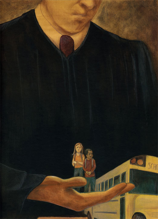
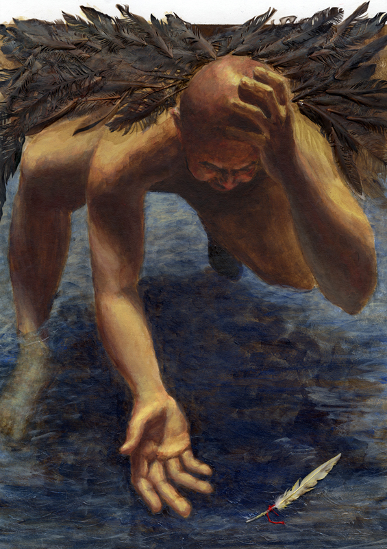
[12] - Wanna-be Academiers- June-July
Try to do the Illustration Academy assignments, or at least the idea-making and thumbnail part of it. Experiment, try something new, push yourself. Also use this time to catch up on old projects if you want!
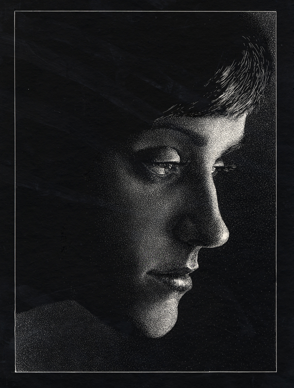
[1] - SELF PORTRAIT - due Aug 31
Posted finishes:
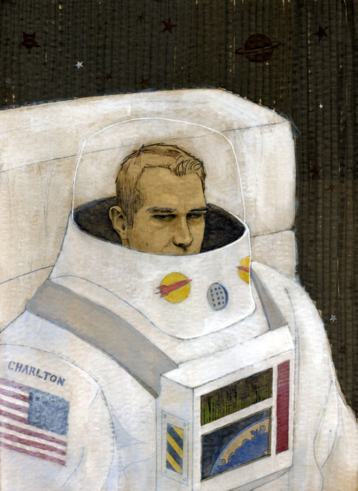
Chris |
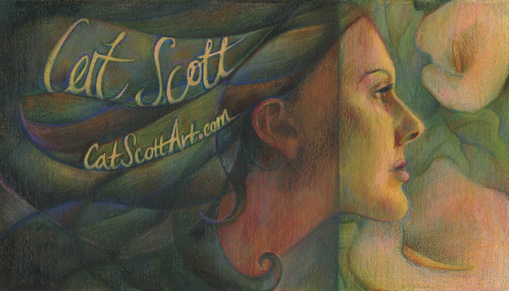
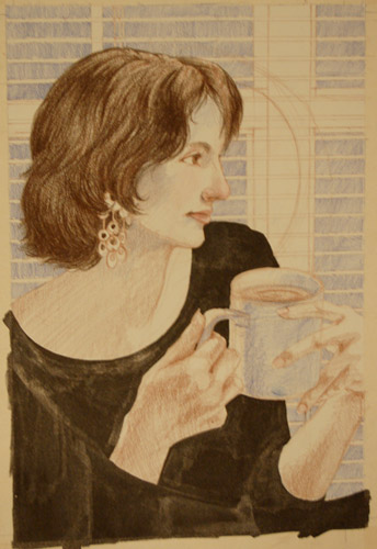
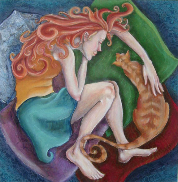
Cat |
Erika |
Sarah |
Tyler |
Heather
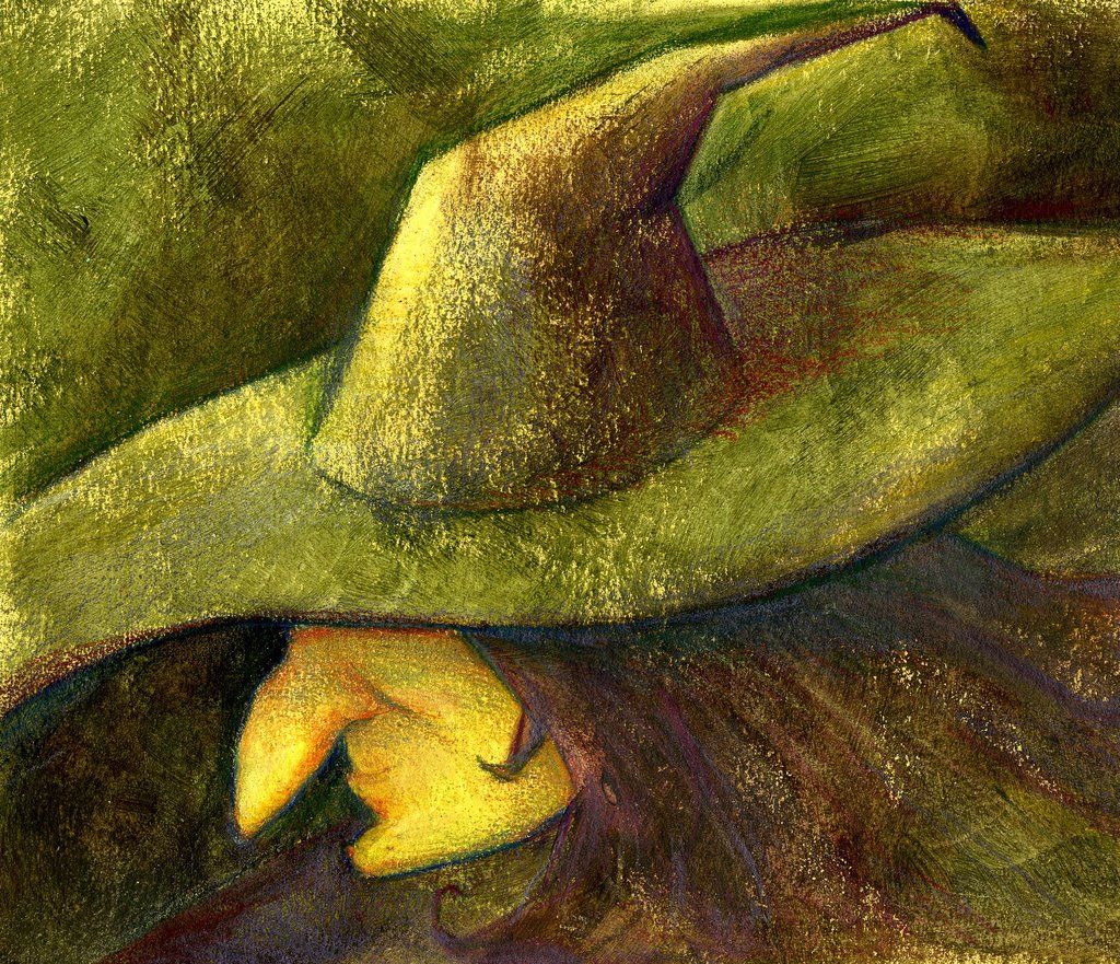
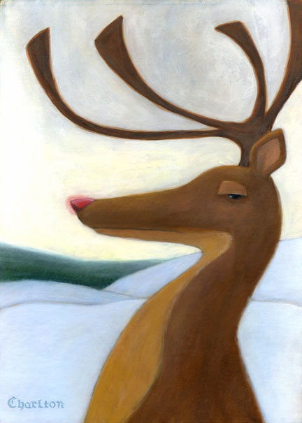
[3] - HALLOWEEN - due Oct 2
Posted finishes:
Cat
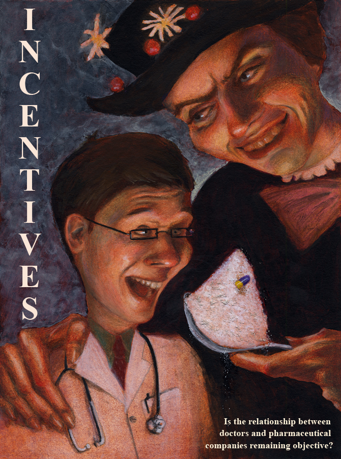
[4] - EDITORIAL - due Oct 16
Posted finishes:
Chris |
Heather |
Cat
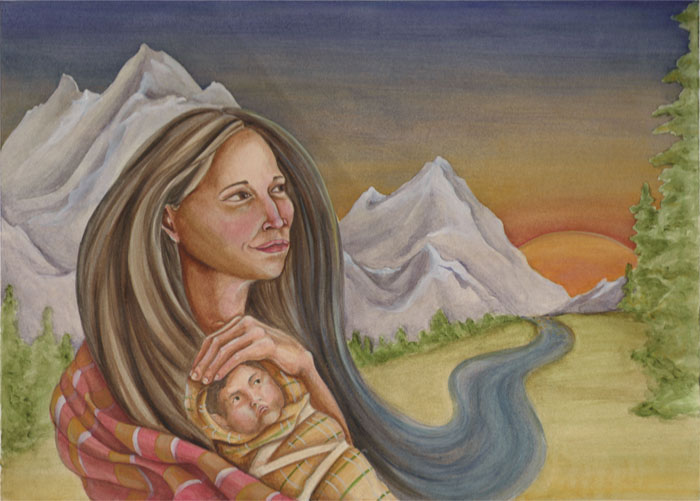
[5] - SHORT STORY - due Oct 30
Posted finishes:
Heather |
Tyler
[7] - CELEB PORTRAIT - due Jan 31
Posted finishes:
Tyler
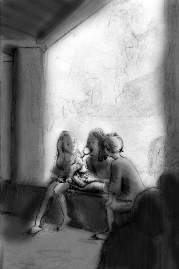
[8] - CONVERSATION - due Feb 28
Posted finishes:
[9] - NIGHT COLOR - due Mar 31
Posted finishes:
[10] - ENTERTAINMENT- due April 30
Posted finishes:
[11] - MAD COW - due May 31
E-mail me if you need the article again
Posted finishes:

5 Comments:
heather, from what I can see it look awesome, but it won't let me view the larger version because "it has errors." Can you try saving it again (make sure it's RGB) and upload it again? I am excited about it.
fixed it to RGB!
I think the limited writing area on the stationary would be problematic. It looks like two-thirds of the page is taken up with the artwork. Everything else looks good. I especially like your business card.
I think the business card is my favorite as well! I think it's a really clever idea (don't forget), plus a really beautiful drawing.
What tyler said is what I was thinking - of course, if you designed your text space to balance nicely with the illustration of the hand, it could work really well. You just wouldn't have a ton of room to write, but you aren't writing an essay or anything. So it's all good. Oh and also as far as printing goes, it's pretty much impossible to print a bleed on an envelope (unless you print on paper, cut it out, and spray mount it to an envelope) but it's a good idea! For practical purposes you would want to design something a little simpler, maybe a tiny drawing of a hand since that's the recurring theme.
Post a Comment
<< Home