Academy - Week Two


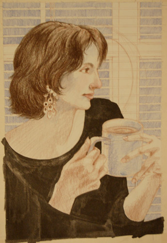
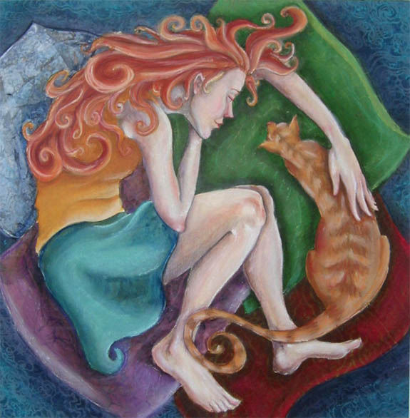
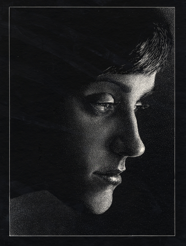
Remember those critiques that lasted over six hours? They still happen. The James Lipton piece was my first one... the one for which I got approval and everything. The second piece (featuring Ty Cobb) was my fun piece that I did on Sunday after I finished Lipton. I just can't escape Payne (regarding the Ty Cobb portrait). I'm going to have to start avoiding looking at his work. I didn't even use his technique. I tried painting all in acrylic for once (no oil wash or colored pencil) and that's how it turned out. Gary says it's the drawing, subject matter, and colors. I love baseball, so it's going to take all my strength not to imitate his work... and I don't want to surrender that subject matter. However, I had a lot of fun painting the details in the Ty Cobb piece.
Next Assignment: Illustrate "Blue" ...since we weren't given the spelling, we played with the idea of illustrating "blew."
Hardy har har.
posted by Tyler at 6:38 PM
![]()
![]()

7 Comments:
Yay Tyler! I love the composition on the baseball one (those three squares at the top!!), and I really like James Lipton's hand! Beautiful job!
well, yiu again answered all my questions in one post. And yes I thought you would get the nod of approaval with the portrait. I think the Ty Cobb looks good too but it is too typical(ala C.F. payne). Whats wrong with that? NOTHING!, it is only fair and right for you to have that experience, that you should work hard for a similar look in th work that you see all the time. Just don't stay there. Great, i am proud of your efforts!
Blue? Blew? whats up with that for an assignment? hmmm.
Don
Nice! Really like these... You are doing awesome man! The hand is really cool, I like the color in that corner. And Im digging the baseball letters... Thats not on cardboard right?? I think its neat that you are really working the cardboard technique... I mean I figure that baseball portrait is on illustration board, but I am really liking the punch of the colors you are getting on that cardboard ones you are doing too!
hum... blew,.... blue... go tsomething in mind,.. I'll sketch it and post it.
Cool, both of those look really great, and I can't believe you could do both in such a short time frame and with such professionalism. I love the texture that the cardboard creates. Very cool.
I bet at least 50% of the students do a blues or jazz singer for this portrait. Be creative Tyler, do something wild!!!
p.s. With more students, those critiques must be UNBEARABLE.
Yup, Cobb is on illustration board.
There was a really funny moment when an illustration of Abraham Lincoln was put up next to an illustration of John Wilkes Booth...with the gun facing Lincoln. There was plenty of laughter with that one.
Of course, there were portraits of Edgar Allan Poe. All we need now is a portrait of Billie Holiday... but I'm sure this "blue" assignment will fetch one or two. Also, there were quite a bit of portraits with someone peeking out behind something, usually a curtain.
And of course there are a couple of students that routinely get defensive during critiques. It's actually worse than that, but I won't take the time to type it out. Here's a quick quote, "illustration is arbitrary"... imagine Sterling's rage. There was fire in his eyes as he repeated it back to the student in the form of a question.
I refuse to ever do a Blues/Jazz piece for the Academy.
Thanks for all the supportive comments! I'll keep crankin'!
Nothing like a six hour critique after staying up all night working on your piece!
Looking good Ty, I would watch the modeling on the back of the hand kindof flattens out the form, also you might want to lighten or darken the background to separate Lipton's hair and jacket from it.
The baseball one looks great. I wouldn't worry about it looking too much like CF Paynes work. We all have artist that we connect with and I think its important to look at and do studies of the artist you like to find out what about it you like so much. Then you can take what you like and combine it with other things you like to create artwork that is really personal. So I wouldn't say stop look at Paynes work, continue looking at his work, as well as a lot of other varied artist.
Blue? you should do a piece thats all reds and oranges with like a tiny blue hat or something in the corner.
Tyler, i really like the approach to the cobb piece, i see what you're saying about Payne. i think the colors lend themselves to a nostalgic feeling, couple that with Paynes ability to capture "our everyday lives" in his work automatically give it a place close to our hearts. I think that is what you have hit with this Cobb piece. Norman Rockwell's style is one who also is able to capture everyday things we did or hear about. you might try revisiting some of his work to stretch what you find yourself repeating from Paynes. See what happens when you marry Payne, Rockwell with yourself.
Every prof in school saying no hard lines when we were painting but i have always like what they bring to a piece. Maybe on Lipton push the extremes of the soft edges in the face, or make them crisp, (like Cobb's crisper definition in the the eyes and brows).
i miss the linear elements in lipton's background. Your working it in the Cobb piece where you have the line at the top of the bleachers pick up in the shadow of the cap on cobb's forehead and dump right back into the bleachers. Its clever when the background dances with foreground. Keep it up.
BRi
Post a Comment
<< Home