Blue Max

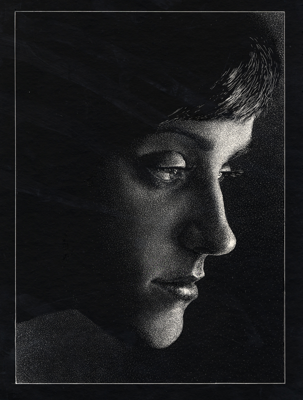
Well, here's my "Blue" illustration. It's based on the Prussian (later German) medal Pour le Mérite, nicknamed the Blue Max after its color and an early German World War One ace, Max Immelmann. The Blue Max could be awarded to members of all German military branches but is most recognized with the German aviators of World War One. This was largely due to the German propaganda of the period. That's why I made a German WWI propaganda poster image. For inspiration I looked to German printmaker Ludwig Hohlwein. When the German empire fell in 1918, the medal ended its service.
Mark English and Gary Kelley (among others) critiqued it. They wanted blue at the top of the poster, more values in the face, and less detail in the medal. I made corrections to the first two issues but not the third. I didn't want to erase all that detail work :/ I'm not really that thrilled with it. I learned that I really enjoy looking at images in this style, but I do not enjoy painting like this.
************************************************
UPDATE: Unfortunately, the photo isn't all that great. I "fixed" the fixes and did a wash. I'm done working on this. Time to move on.

posted by Tyler at 11:58 PM
![]()
![]()

5 Comments:
Tyler, strong piece again, I do see the need for more value, I like the idea of blue at the top but not sure why about the too much detail on the medal, maybe I can;t really see it in the photo (maybe the photo and the jpg made it look like it should - less detail), I like the value pattern, the inside part of his uniform could be much darker - black, not sure if I like the shapes of the eye sockets nor the bridge that goes between the eyes, maybe less there. Thanks for putting up the finish with the value comps. Did sterling have any there you took pics of.
Good luck and keep going!
Don
I like this Tyler, I think it's very striking. I can understand how you didn't really enjoy painting it though, that's how I feel whenever I paint really flat graphic stuff... "well that looks really cool, but it wasn't that fun to paint".
I really like where you went with "Blue". I bet it was totally different than anyone else at the academy. Go you!
I think I might have to disagree with Mark English and Gary Kelley and say you need LESS value in the face. I'm thinking you could have done something like Mark English's "Dracula" piece where the face acts like one shape. Probably not as white as Dracula's face, but not quite as contrasty either. Just a thought :) Oh and nice work on the original idea for blue. Can't wait to see what's next! I guess it's lecture week now, isn't it.
Cat, very good observation regarding the face, I think I might like to see the face as a less value contrasting rendering and allow the face be the important shape and the features as subtle shapes within the face shape. ok Tyler get to work and redo this for tomorrow! :-)
Don
Thanks for all the comments!
It's being fixed again. I'm fixing my "fixes."
I'll post a new photo of it soon.
Post a Comment
<< Home