ROUGH THUMBS


Hey guys,
I am working on a piece and here are some rough sketches for composition. I want to put some layers of collage ( fabric) as parts of the hot air balloon and around it... I also want to use some pen and ink along with paint/ colored pencil/ watercolor in places too.
Which is the most interesting composition so far?
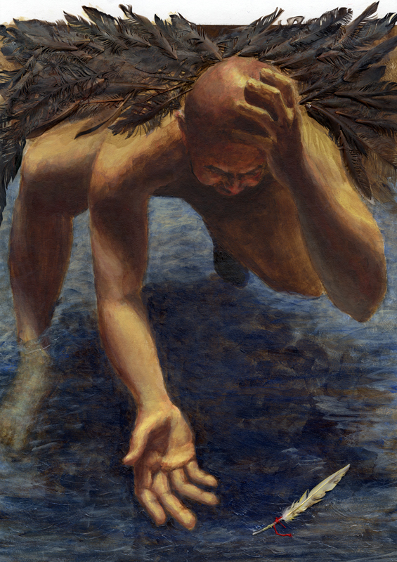
Oh and the bird painting is the one that is a finalist in the jjill contest. Go to jjill.com under "nature of compasstion" to vote if you get the chance! Funny thing to note- When I submitted the bird I wasn't happy with where it was so since then - on the original piece- painted over the bird, (keeping the shape) collaged in more fabric and painted in the top left corner...
posted by Kim at 12:24 AM
![]()
![]()

4 Comments:
That's so exciting! You're one of 10 finalists!! Go Kim!! What happens if you win. The final piece looks awesome, I love the flower shapes.
I think I really like the first composition, I like the two balloons, with their stripes going different directions, but I really like the swirly things in the air in the other two. I think the second one is very nice too. The third one is the most simple, but then with all of the colors, I don't know if in the end that one would be easier to read...hmmm. So now i just made things more confusing. I think it will turn out great, I think #1 is the strongest.
First of all, congratulations on being a finalist!! That's awesome, Kim.
About the thumbs... So far I like number 2 the best... but right now they're all pretty much line drawings and they really need some values. I think 3 could be good but I noticed that it's a square right now and I wonder if it's meant to be the same dimensions as the first two. If so, then I think it would really change the balance. And with some tracing paper, maybe see what a hint of a top of a balloon would look like at the bottom of the compositions.
Kim, I have already voted and have told a lot of people to vote - and they all LOVE what you did! most have said they will buy it once it wins and is printed :)
Second of all, I love your thumbnails - I personally prefer the bottom one. The text is a visually heavy area that I think could be nicely balanced by the big colorful balloon. I think the other ones would work just so long as the colors don't compete too much with the text.
well I guess I have to say I prefer the bottom sketch. I like all the type at the bottom and the balloon floating/rising above - good luck,
Don
Post a Comment
<< Home